What is Responsive Web Design?
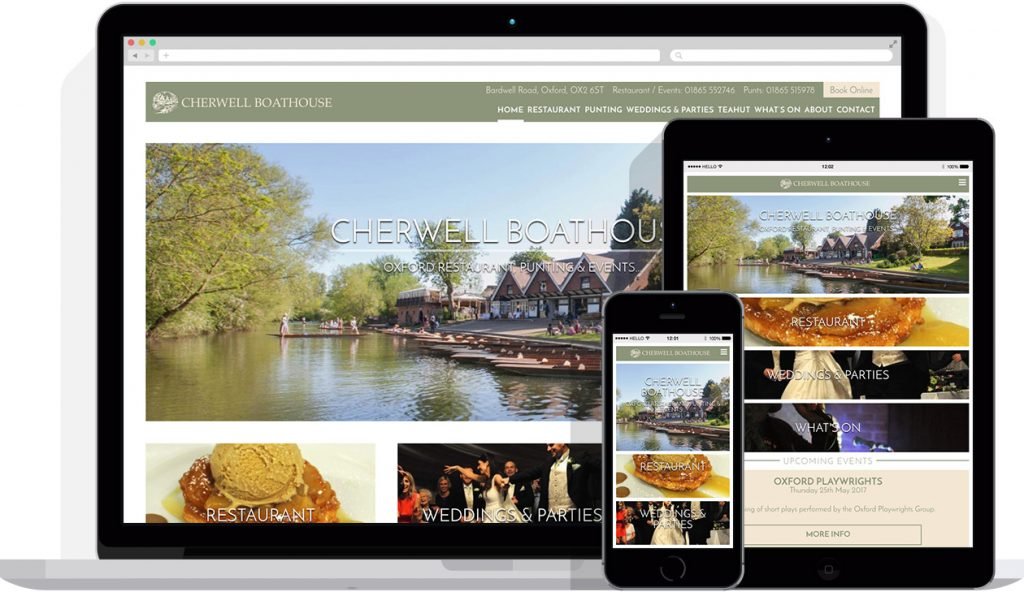
Responsive web design is an approach to creating websites that allows them to adapt to different screen sizes and devices.
With the increasing number of devices that people use to access the internet, from smartphones and tablets to laptops and desktops, it has become essential for websites to be designed in a way that ensures they are accessible and user-friendly no matter what device they are viewed on.
The concept of responsive web design has been around for over a decade, but its importance has increased in recent years as more and more people use mobile devices to browse the web. Over half of all internet traffic worldwide now comes from mobile devices, making it clear that websites must be designed with mobile users in mind.
Responsive web design involves creating a single website that can adapt to the screen size of the device it is being viewed on. This is achieved by using flexible layouts and grids, and by adjusting the size and positioning of elements such as images, text and navigation menus.
One of the key benefits of responsive web design is that it can improve the user experience for visitors to a website. When a website is not optimised for mobile devices, users may have to zoom in and out to read the text, or they may have difficulty navigating the site using a touchscreen. This can lead to frustration and a higher bounce rate.
By contrast, a website that has been designed with responsive web design in mind will automatically adjust to the size of the user’s screen, making it easy to read and navigate on any device. This can help to keep visitors on the site for longer and increase engagement with the content.
Another advantage of responsive web design is that it can be more cost-effective than creating separate mobile and desktop versions of a website. With a responsive design, there is no need to create multiple versions of the same content, which can save time and money in development and maintenance costs.
In addition, responsive web design can improve a website’s search engine rankings. Google, the world’s most popular search engine, now prioritises mobile-friendly websites in its search results, so a website that has been optimised for mobile devices is more likely to rank higher in search results.
Responsive web design is now an essential part of modern web design. With the increasing number of devices that people use to access the internet, it is crucial that websites are designed to be accessible and user-friendly on any device. Responsive web design improves user experience, saves time and money in development and maintenance costs, and improve search engine rankings.